Ce client souhaitait créer une activité de VTC dans la région alpine, avec pour but d’accompagner les clients entres les stations de sports d’hiver et les aéroports/gares de la région.
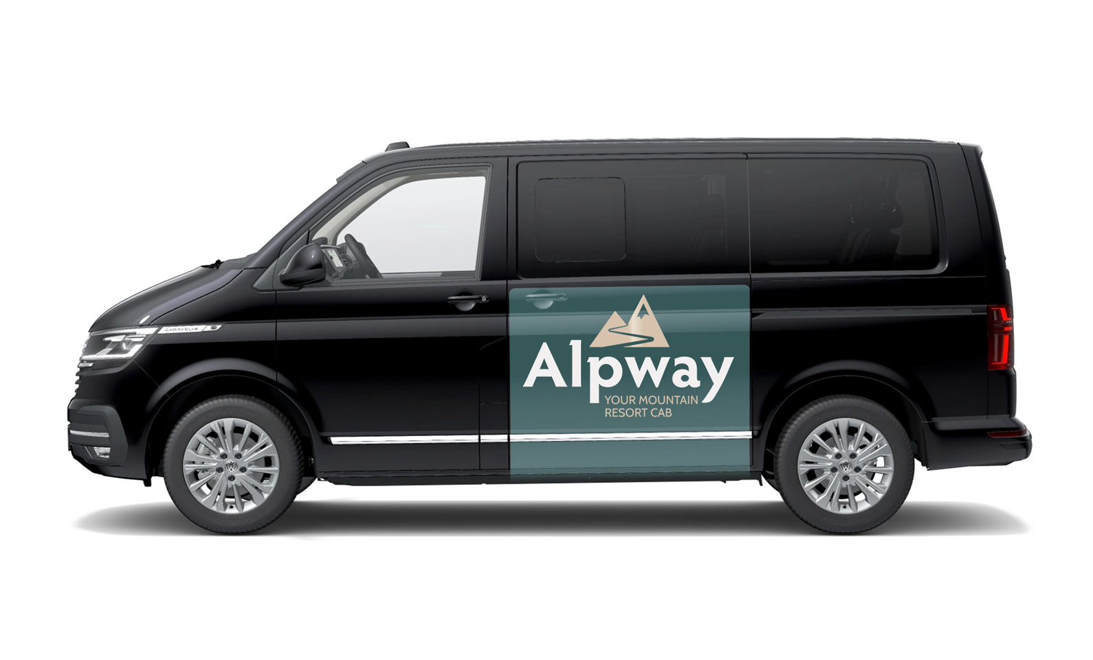
Ma mission : trouver un nom, ainsi que l’identité visuelle pour l’entreprise (logo, décors de véhicules, cartes…).
Objectifs : Evoquer le dynamisme, la sécurité, la courtoisie et la ponctualité, se démarquer des sociétés de VTC concurrentes qui utilisent souvent les mêmes clichés (logo avec un visuel de voiture, de la dorure, aspect mécanique / références à la course automobile).
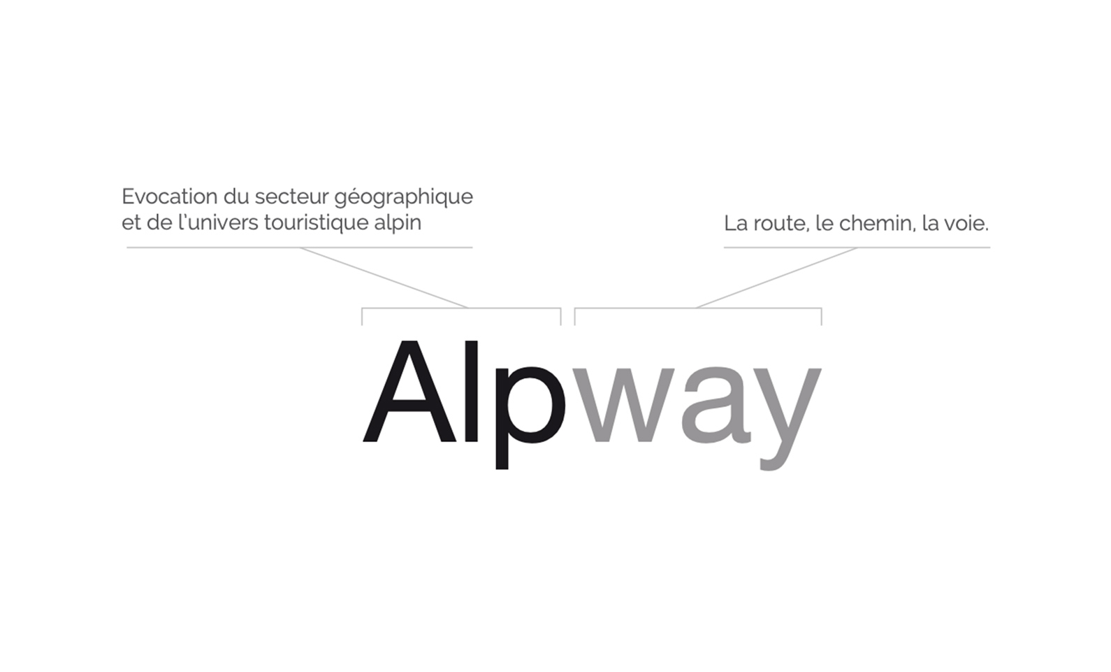
Après quelques jours de recherche (et vérification des disponibilités de marque et adresse internet) j’ai proposé plusieurs noms, et une a retenu particulièrement l’attention : ALPWAY. Formé de 2 syllabes : « ALP », Le préfixe évoque à la fois le secteur géographique, la montagne et l’univers des sports d’hiver,de façon très courte et efficace. « WAY » : la seconde partie du nom évoque la route, le chemin, qui permet d’accéder à cet univers en toute sécurité et confort grâce à l’expertise de votre chauffeur. Un aspect important était de proposer un nom qui puisse être compris par la clientèle internationale.
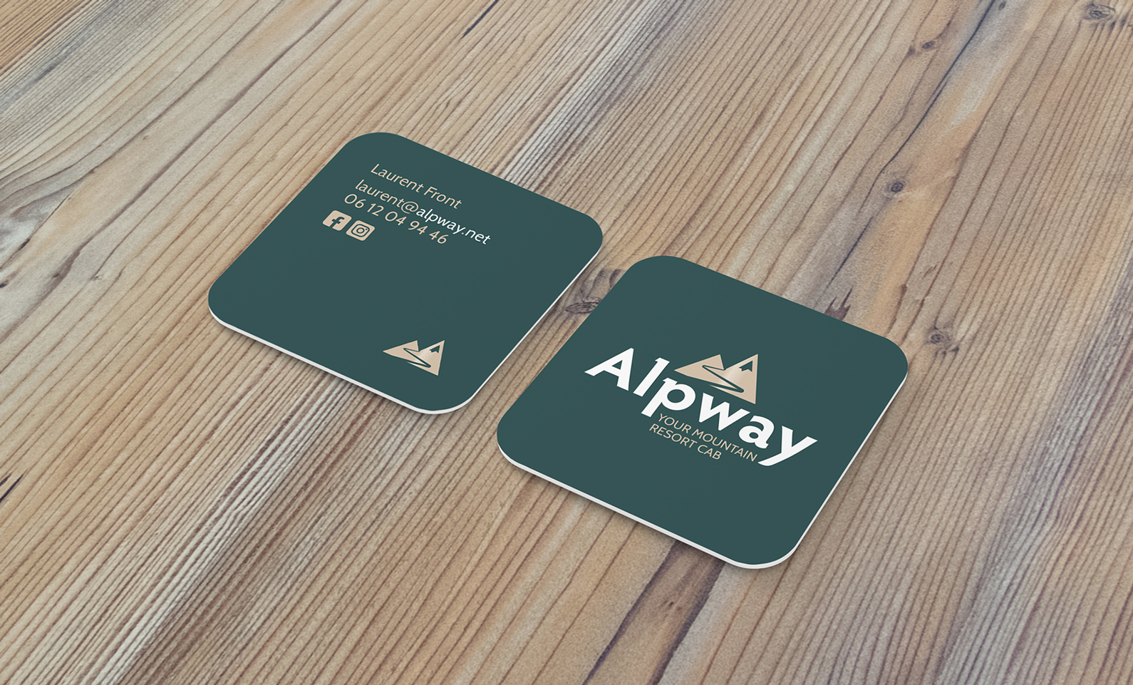
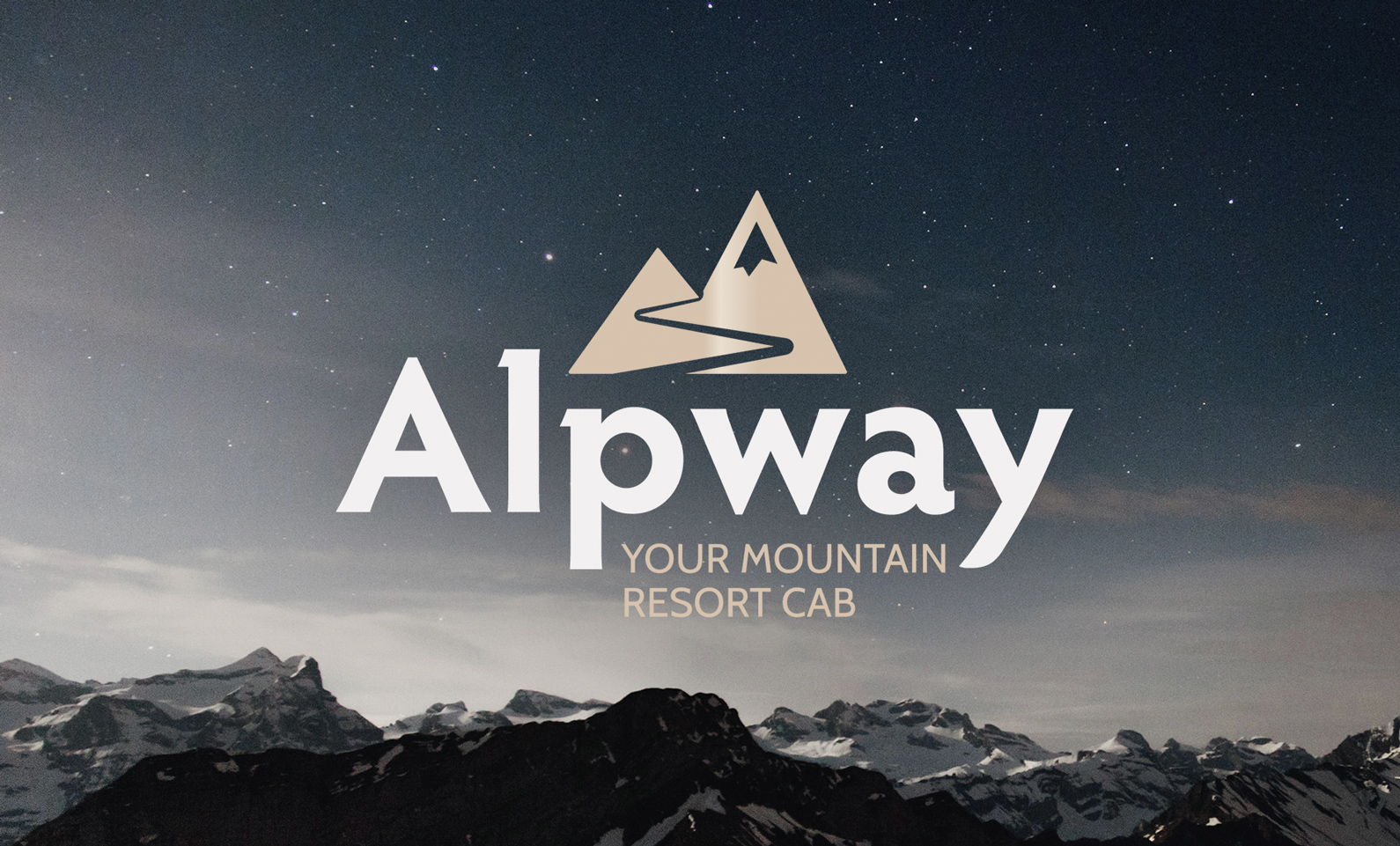
L’identité visuelle quand à elle évoque le vert des aiguilles de sapin, mais aussi celui des luxueux véhicules anglais, le tout associé à un dégradé doré pâle forme un ensemble chic et discret.
Projet réalisé pour Ma petite com’.
–
My client was creating a tourist transport business in the alpine region, with the aim of accompanying customers between winter sports resorts and airports/train stations in the region.
Mission: find the name, and the brand identity for the company (logo, vehicle decoration, cards, etc.).
Brief: To evoke dynamism, safety, courtesy and punctuality. To stand out from competing tourist transport service companies which often use the same clichés (logo with a car visual, gilding, mechanical aspect / references to motor racing).
After a few days of research (and checking of brand and domain name availability) I proposed several names, and one particularly caught my attention: ALPWAY. Made up of 2 syllables: « ALP », the prefix evokes both the geographical sector, the mountains and the world of winter sports, in a very short and effective way. « WAY »: the second part of the name evokes the road, the path, which allows access to this universe in complete safety and comfort thanks to the expertise of your driver. An important aspect was to come up with a name that could be understood by international customers.
The visual identity evokes the green of pine needles, but also that of luxurious English vehicles, all associated with a pale golden gradient forms a chic and discreet design.
In partnership with Ma petite com’.